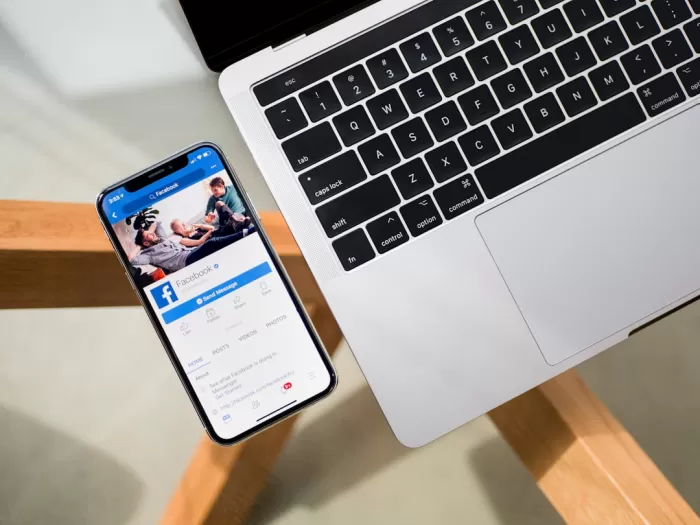
Responsive Design Implementation

Mobile-friendly Video Content Optimization Strategies:
-
1. Responsive Video Players:
Use responsive video players that adjust to different screen sizes. For example, Vimeo and YouTube embed codes automatically adjust to fit the screen of the device being used.
-
2. Shorter Video Length:
Consider creating shorter videos that get straight to the point. For instance, instead of a 10-minute tutorial, break it down into smaller 2-3 minute segments for easier viewing on mobile devices.
-
3. Subtitles and Closed Captions:
Include subtitles or closed captions in your videos to make them accessible to viewers who prefer to watch without sound. This also helps in situations where viewers may be in a noisy environment.
-
4. Optimize Video Thumbnails:
Choose visually appealing and descriptive thumbnails for your videos. This can entice mobile users to click and watch your content.
Responsive Design Implementation:
-
1. Fluid Grid Layouts:
Utilize fluid grid layouts that adapt to different screen sizes. This ensures that your website and video content are displayed correctly across various devices.
-
2. Flexible Images and Media:
Make sure images and media elements are flexible and can resize proportionally. This prevents them from being cut off or distorted on mobile screens.
-
3. Breakpoints for Different Devices:
Set breakpoints in your CSS to adjust the layout of your website at different screen sizes. This helps in providing an optimal viewing experience for mobile users.
-
4. Touch-friendly Interactions:
Ensure that buttons, links, and other interactive elements are easily tappable on touch screens. This enhances user experience and engagement on mobile devices.
Shorter Video Length

Mobile-friendly video content optimization strategies
One effective strategy to optimize video content for mobile devices is by keeping the video length short and concise. Mobile users tend to have shorter attention spans, so it's important to deliver your message quickly and efficiently.
For example, instead of creating a 10-minute tutorial video on a complex topic, consider breaking it down into shorter 2-3 minute videos focusing on specific subtopics. This not only makes the content more digestible for mobile viewers but also increases the likelihood of them watching the entire video.
Furthermore, shorter videos are easier to load and stream on mobile devices, reducing the risk of buffering issues that could deter users from engaging with your content.
Clear Call-to-Actions

Optimizing Video Content for Mobile Devices
With the increasing number of users accessing content on mobile devices, it is crucial to optimize your video content for a seamless viewing experience.
1. Responsive Design:
Ensure your video player is responsive and adjusts to different screen sizes. This will help prevent any issues with playback on various devices.
2. Short and Engaging Videos:
Create videos that are concise and engaging to capture viewers' attention. Consider using subtitles for better understanding, especially in a noisy environment.
3. Video Quality:
Optimize your videos for quick loading times without compromising on quality. Use formats that are compatible with mobile devices to ensure smooth playback.
4. Clear Call-to-Actions:
Include clear call-to-actions (CTAs) in your videos to guide viewers on the next steps. For example, "Click here to learn more" or "Swipe up to shop now."
5. Mobile-Friendly Thumbnails:
Choose visually appealing thumbnails that are easy to see on smaller screens. Thumbnails play a significant role in attracting viewers to click and watch your video.
6. Optimized Video Descriptions:
Write concise and compelling video descriptions that provide context and encourage viewers to engage with your content. Include relevant keywords for better discoverability.
7. Utilize Social Sharing:
Make it easy for viewers to share your videos on social media platforms directly from their mobile devices. This can help increase your video's reach and engagement.
8. Monitor and Analyze Performance:
Track the performance of your video content on mobile devices using analytics tools. Identify what works best and adjust your strategies accordingly for optimal results.
Subtitles and Closed Captions

One important strategy for optimizing video content for mobile devices is to include subtitles and closed captions.
For example, imagine someone is watching a video on their phone in a noisy environment where they can't turn up the volume. Having subtitles allows them to follow along with the content without needing to listen.
Additionally, closed captions are beneficial for accessibility purposes. They help individuals who are deaf or hard of hearing to understand the video.
By including subtitles and closed captions in your videos, you can make your content more inclusive and reach a wider audience, including those who prefer to watch videos without sound or in environments where audio is not feasible.
Optimize for Vertical Viewing

Why Optimize for Vertical Viewing?
With the rise of mobile usage, optimizing your video content for vertical viewing has become crucial. Vertical videos take up the entire screen on mobile devices, providing a more immersive viewing experience for users.
Key Strategies for Vertical Video Optimization:
- Aspect Ratio: Aim for a vertical aspect ratio such as 9:16 to ensure your video fills the screen without any black bars on the sides.
- Content Placement: Place important content and visuals in the center of the frame to ensure they are not cut off on smaller screens.
- Text Size: Use larger text sizes for titles and captions to ensure readability on mobile screens.
- Engaging Thumbnails: Create eye-catching thumbnails that are optimized for vertical display to attract users to watch your video.
- Mobile-Friendly Editing: Edit your videos in a vertical format from the beginning to avoid cropping or stretching issues.
Examples of Vertical Video Content:
1. A makeup tutorial shot in vertical format to show step-by-step application on a mobile screen without the need to rotate the device.
2. An Instagram story teaser using vertical video to promote a new product launch, optimized for viewing on smartphones.
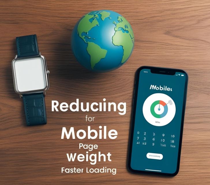
Fast Loading Speed

Importance of Mobile-friendly Video Content Optimization Strategies
With the increasing use of mobile devices for online content consumption, it is essential to optimize video content for mobile users. Here are some strategies to ensure that your videos are mobile-friendly:
- Responsive Design: Ensure that your video player is responsive and adapts to different screen sizes. This will provide a seamless viewing experience across various devices.
- Optimize Video Format: Choose video formats that are compatible with mobile devices, such as MP4. This will help in faster loading times and smoother playback.
- Mobile-friendly Controls: Use large, touch-friendly buttons for play, pause, and volume control to enhance the user experience on mobile devices.
- Fast Loading Speed: Optimize your videos for fast loading speed to reduce buffering time and keep viewers engaged. Compress videos without compromising quality to improve loading times.
Thumbnail Optimization

Thumbnail Optimization
Thumbnails play a crucial role in attracting viewers to your video content. Here are some strategies to optimize your thumbnails for mobile:
- Use High-Quality Images: Ensure that your thumbnails are clear and visually appealing even on smaller screens.
- Include Text Overlay: Add concise and engaging text on the thumbnail to provide context and grab attention.
- Branding: Maintain a consistent visual style and branding elements to make your thumbnails easily recognizable.
- Contrast and Color: Use contrasting colors to make elements stand out and ensure readability on different devices.
- Avoid Clickbait: While it's important to be enticing, ensure that your thumbnail accurately represents the content to build trust with viewers.
By implementing these thumbnail optimization strategies, you can enhance the visibility and click-through rate of your video content on mobile devices.
Mobile SEO Best Practices

If you want your video content to perform well on mobile devices, it's crucial to optimize it for mobile SEO. Here are some best practices to help you achieve that:
1. Responsive Design
Make sure your video player is responsive and adjusts to different screen sizes. This will ensure that your video looks good on any device, whether it's a smartphone or a tablet.
2. Fast Loading Speed
Optimize your videos for fast loading speeds by compressing the files without compromising quality. Slow-loading videos can lead to higher bounce rates and lower rankings on search engines.
3. Mobile-Friendly Formats
Use mobile-friendly video formats like MP4 to ensure compatibility across different devices and browsers. This will make it easier for mobile users to access and watch your content.
4. Relevant Keywords
Include relevant keywords in your video title, description, and tags to improve visibility on search engine results pages. Conduct keyword research to understand what terms your target audience is searching for.
5. Engaging Thumbnails
Create eye-catching thumbnails that are visually appealing and accurately represent the video content. Thumbnails play a crucial role in attracting clicks and views, especially on mobile devices.
6. Clear Call-to-Actions
Include clear and concise call-to-actions in your video, prompting viewers to take the desired action, such as subscribing to your channel, visiting your website, or sharing the video with others.