Google pays special attention to mobile-first indexing, where the architecture of a mobile website is crucial for any page's ranking in Google's top rankings.
A well-designed web page structure makes it easier for search crawlers to insert the content of any site into search engines like Google or Bing, improving and prioritizing visibility in search results.
Maintain a Flat and Logical Site Structure
One of the most important foundations of effective web architecture, especially in the context of technical SEO and mobile-first indexing, is maintaining a flat and logical site structure.
This practice involves organizing content so that all important pages are accessible with just two or three clicks from the home page, on both mobile and desktop devices.
What is a flat site structure?
A flat structure is one in which the number of hierarchical levels between the home page and any internal pages is minimal. In other words:
- There's no need to "dive" too deeply into navigation.
- URLs aren't buried in complex layers like /category/subcategory/product/extra/other/...
- Every essential page on the site is quickly accessible from menus, internal links, or optimized navigation structures.
This is opposed to a deep structure, where users (and Google bots) have to click multiple times to find a specific page.
In the context of mobile analytics, where user patience is limited and resource crawling may be more restricted, this represents a major disadvantage.
Benefits of a Flat and Logical Structure
1. Improves Crawlability for Bots.
Search engine bots allocate a "crawl budget" to each website: the number of URLs they are willing to crawl in a given period.
If your important pages are buried under multiple levels or poorly linked, they may never be crawled or indexed.
A flat structure ensures that Google bot accesses your key content more quickly, maximizing the efficient use of the crawl budget. This is especially relevant with mobile-first indexing, where Google crawls the mobile version of the content first.
2. Better distributes SEO authority (link equity).
A logical, shallow architecture allows link authority (link juice) to flow more evenly from the home page to internal pages. This gives more pages a chance to rank well in search results.
3. Improves user experience (UX).
From a user perspective, a logical structure makes content easier to find. On mobile devices, where screens are smaller and navigation can be more complex, simplifying the number of steps to find what they're looking for translates into lower bounce rates and longer sessions.
How to implement a flat, logical structure on mobile sites?
Here are some practical tips to apply it to your site architecture:
1. Design clear, hierarchical navigation, but without excessive depth.
- Use a responsive drop-down menu with links to the most important sections.
- Make sure category pages link directly to their subcategories or products.
- Use breadcrumbs to help users and bots understand the hierarchy.
2. Use strategic internal links.
- From your main content (such as articles or service pages), link to other relevant pages.
- Add links to related content within articles to facilitate navigation and crawling.
3. Regularly audit site depth.
- Tools like Screaming Frog or Sitebulb can help you see how many clicks separate each URL from the home page.
- Identify and restructure pages that are more than three clicks away.
4. Avoid unnecessarily long URL structures.
- A URL like https://mydomain.com/blog/2025/may/mobile-first/architecture/mobile/site/flat is difficult to crawl and understand.
- Prefer: https://mydomain.com/blog/architecture-mobile-sites
- Visual example of a flat structure
Visual example of a flat structure
Deep structure:
Home > Category > Subcategory > Product > Information > Reviews
Flat structure:
Home > Category > Product/Review (max. 2-3 clicks)
Implement Responsive Design
Responsive design is a type of web design that automatically adapts to different screen sizes and devices, from mobile devices to tablets and large desktops.
Implementing responsive design is not just a matter of visual design, but a technical strategy that directly affects SEO, indexing on Google or Bing, and the user experience when browsing a website.
What is responsive design?
Responsive Web Design (RWD) is a web development technique that makes a site's content fluidly adjust to the screen width of the user's device.
Instead of creating separate versions of the site (e.g., m.example.com for mobile and www.example.com for desktop), a single URL is used that adapts to the user's device.
Why is it crucial for mobile-first indexing?
Since 2019, Google has used the mobile version of a website's content as the primary basis for ranking and indexing, even if the user is searching from a computer. This means that:
- If your mobile site doesn't offer the same content as the desktop version, you will lose visibility.
- If your mobile version is slow or has navigation issues, it will negatively affect your rankings.
- If you use a responsive design, Google can efficiently crawl and index your content from any device, without confusion between versions.
In Google's words: "If your site isn't responsive and has a separate mobile version, make sure both versions are well synchronized. But ideally, you should have a responsive site with consistent content."
Key Benefits of Responsive Design for Crawlability and SEO
1. Avoid Duplicate Content
With a responsive design, you have a single URL per piece of content, avoiding duplicate or canonical content issues between mobile and desktop versions.
2. Better use of crawl budget
Bots (Google or Bing crawlers) don't have to crawl two separate versions of the site, which reduces the load on crawling resources and improves index coverage.
3. Unified user experience
A site that works equally well on any device increases time on page, reduces bounce rates, and improves conversions. This, in turn, positively influences rankings.
4. Easier maintenance
Having a single design reduces technical maintenance work and makes it easier to apply improvements uniformly across the entire site.
Best practices when implementing a responsive design
1. Use CSS media queries
If you are a web design technician or have contact with a web design technician, you should make sure that your website's *. CSS files have statements similar to the following:
@media (max-width: 768px) {
  .content {
    flex-direction: column;
    padding: 1rem;
  }
}
This type of statement ensures that paragraphs identified by ".content" for screens with a maximum of 768 pixels apply a series of commands that facilitate the page's display on these smaller devices.
2. Tip for Designing with a Mobile-First Approach
Start by designing for small screens and then scale to higher resolutions. This ensures a good experience in the most limited environment.
3. Avoid the Use of Floating Windows and Intrusive Elements
Pop-ups or poorly adapted ads can interrupt mobile browsing and are penalized by Google if they affect usability.
4. Ensure All Elements Are Accessible
Drop-down menus, buttons, forms, and other elements should be optimized for finger navigation and not rely on a cursor.
5. Test your site on multiple devices and emulators
Tools like Google Mobile-Friendly Test, Taptu.mobi, or Chrome DevTools allow you to evaluate how your site looks and behaves on real devices.
Example of responsive design applied
On a well-designed site:
- The main navigation becomes a "hamburger menu" on mobile devices.
- Images resize automatically (max-width: 100%).
- Content reorganizes into columns or rows based on available space.
- Text remains legible without the need to manually zoom.
Optimize Loading Speed: Key to Mobile-First SEO
A site's loading speed has become a determining factor for success. If your mobile site is slow, you'll lose interested users, no matter how optimized your content is.
Why does speed matter for SEO and crawlability?
1. It directly impacts crawl budget.
Googlebot allocates a crawl budget to each site. If your site is slow, the bot will spend more time on each page and will be able to crawl fewer URLs per visit. This means some pages may never be indexed.
2. Reduce the number of users who leave the site without interacting.
If a page takes more than 3 seconds to load, most mobile users leave.
A site that loads in 2 seconds has a 50% lower bounce rate compared to one that takes 5 seconds or more.
3. It directly affects Google rankings.
Since the introduction of the Page Experience and Core Web Vitals updates (within Google Search Console), metrics such as Largest Contentful Paint (LCP), First Input Delay (FID), and Cumulative Layout Shift (CLS) have become ranking factors.
These metrics can be analyzed using Google's official tool: https://pagespeed.web.dev/
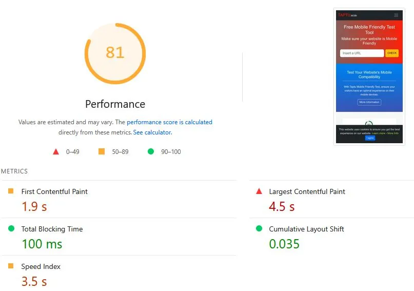
Core Web Vitals: LCP, FID, CLS
1. Largest Contentful Paint (LCP)
→ Measures: Perceptible loading speed
Definition:
Measures how long it takes for the largest visible element within the viewport, such as an image, video, or block of text, to display from the moment the user starts loading the page.
Example:
If your page loads the logo, then the title, and finally a large cover image, LCP is the time at which that image is fully displayed.
Good result:
✔️ Less than 2.5 seconds
It matters because:
It's a reflection of how quickly the user "sees" something useful on the screen. If it takes too long, the page appears slow, even if everything else continues to load in the background.
2. First Input Delay (FID)
→ Measures: responsiveness/interactivity
Definition:
Measures the time from the user's first interaction with the page (click, tap, keystroke) until the browser responds to that action.
Example:
If a user taps a button as soon as the page loads, but it takes a while to react because it's still loading scripts, that delay time is the FID.
Good result:
✔️ Less than 100 milliseconds
It matters because:
The user expects a page to react quickly. If they click and nothing happens for several seconds, the experience is frustrating.
3. Cumulative Layout Shift (CLS)
→ Measures: visual stability
Definition:
Measures how much the on-screen content moves unexpectedly while the page loads.
Example:
You're reading a text or about to click a button, but the page suddenly rearranges itself because a banner or image loads, and you end up tapping something else. That's a layout shift.
Good result:
✔️ Less than 0.1
It matters because:
A site that moves unexpectedly causes errors, frustration, and even accidental clicks. Google prioritizes sites that are visually stable.
Best practices to improve loading speed
1. Optimize images
- Use modern image formats such as WebP or AVIF.
- Resize images to the exact size they need to be displayed. Under 50 KB.
- Compress without loss with tools such as TinyPNG, Squoosh, or plugins like ShortPixel (WordPress).
Example in HTML format:
<img src="img/producto.webp" alt="Product Name" width="400" height="300" loading="lazy">
2. Enable browser caching
Configure your server so that files that are frequently loaded on your site, such as image files, CSS (design) files, or JS (programming) files, are stored locally in the user's browser for a specified period of time. This reduces repeated requests.
Example for the ".htaccess" file for sites using Apache servers:
<IfModule mod_expires.c>
ExpiresActive On
ExpiresByType image/webp "access plus 1 year"
ExpiresByType text/css "access plus 1 month"
ExpiresByType application/javascript "access plus 1 month"
</IfModule>
3. Minify and combine CSS and JavaScript (JS) files
Reduce file size by removing unnecessary spaces, comments, and empty lines. Whenever possible, combine multiple files into one to reduce the loading speed of a website.
Use useful tools to improve the loading speed of your site's common CSS and JS files:
- UglifyJS
- Terser
- Plugins like Autoptimize, WP Rocket, Vite, or Webpack
4. Use lazy loading
Apply loading="lazy" to images and iframes so they load only when they are about to enter the page viewport.
<img src="img/infografia.webp" loading="lazy" alt="Infographic">
5. Avoid unnecessary redirects
Each redirect adds a delay to the loading process. Make sure canonical URLs and internal links point directly to the final version. That is, each image or CSS or JS file should point to the correct URL, not to another page that redirects to the final page.
6. Choose fast hosting with a CDN
Use web hosting providers that offer modern, fast resources. If possible, implement a CDN (Content Delivery Network) like Cloudflare, BunnyCDN, or Amazon CloudFront to accelerate loading geographically. These CDNs offer common JS and CSS files that are extremely fast and don't use your server resources, which slows things down.
7. Constantly measure and improve with tools
- PageSpeed Insights
- Lighthouse (in Chrome DevTools)
- WebPageTest.org
- GTmetrix
- Lookkle Speed Checker
These tools will help you find bottlenecks in mobile and desktop loading, providing specific suggestions, such as indicating which elements on your page are causing slower loading, allowing you to remove these elements or reduce them in some way.
Real-World Impact Example for a Website: Before and After
Unoptimized Site:
- Mobile Load Time: 8.2 seconds
- LCP: 6.1 s
- Bounce Rate: 70%
- Pages Crawled: 120/day
Optimized Site:
- Mobile Load Time: 2.1 seconds
- LCP: 1.8 s
- Bounce Rate: 35%
- Pages Crawled: 500/day
Use Descriptive and Consistent URLs
A well-designed URL not only improves Google's indexing and understanding, but also provides clarity for users about where they are and what they can expect to find.
What is a descriptive URL?
A descriptive URL includes clear and relevant keywords that accurately reflect the page's content. It is easy to read for both humans and search engines.
Example of a good URL:
https://yoursite.com/blog/mobile-site-architecture
Example of a bad URL:
https://yoursite.com/page.php?id=234&ref=abc
Benefits of having clear and consistent URLs
1. Better understanding by Google.
Google bots analyze the URL structure to understand the content, context, and hierarchy of the site. If your URLs contain relevant keywords—words or phrases that are entered into a Google search and should appear in the URL, title, and headings of the page—they are more likely to rank higher in search results.
2. Increased user trust and clicks.
A clean, readable URL increases CTR (Click-Through Rate) because users quickly understand what the page is about.
3. Facilitates crawling and avoids duplicate content
Consistent URLs prevent the same content from being accessible from multiple variants (for example, with and without parameters), which can lead to duplication issues and waste crawl budget.
4. Improves the mobile experience
On mobile devices, where space is limited, short, readable URLs help users identify where they are without having to scroll or copy confusing links.
Best Practices for SEO-Friendly URLs
1. Include relevant keywords
Use terms or short phrases that define the page's content. This helps both SEO and user clarity.
- Correct example: /mobile-seo-tips/
- Incorrect example: /?cat=54&post=999
2. Use hyphens to separate words
Google recommends using hyphens instead of underscores (_) or HTML-coded spaces (%20).
/seo-tools/mobile-crawlability
3. Make URLs as short as possible without losing clarity
Avoid excessively long paths or unnecessary hierarchies.
- Correct example: /blog/mobile-architecture/
- Incorrect example: /content/articles/seo/mobile/architecture/index.html
4. Avoid unnecessary parameters
Especially on mobile sites, parameters like ?utm_source= or &ref= should only be used when strictly necessary. Otherwise, they can confuse the bot and generate duplicates.
5. Maintain consistency throughout the structure
If your site uses /es/ for the Spanish version and /en/ for English, apply them consistently. This helps with crawling and localization of content.
6. Don't change URLs frequently
Changing a URL forces redirects, temporarily loses rankings, and can break external links. If necessary, always use a permanent 301 redirect.
Ideal URL structure for a mobile-first site: https://yoursite.com/category/subcategory/main-keyword
This type of URL:
- Is easy to remember and share
- Contains keywords
- Reflects the content hierarchy
- Is mobile-friendly
Implement an Internal Linking Strategy
Internal links are the links that connect pages within the same domain. Although they often go unnoticed, they are a crucial tool for:
- Distributing SEO authority (link equity)
- Improving crawlability
- Guiding user navigation
- Strengthening site structure
When used correctly, they help Google bots discover and prioritize the most important pages on your site, especially on mobile devices, where the architecture needs to be more compact and straightforward.
Best practices for a mobile-friendly internal linking strategy
1. Create thematic hierarchies (silos or clusters).
Organize your content by topic and link internally within each group.
Example:
- /seo/
- /seo/mobile-seo/
- /seo/page-speed/
- /seo/internal-linking/
Each link should link to the others on the same topic and return to the hub (/seo/).
2. Use descriptive anchor text
Avoid using "click here" or "read more." The anchor text should clearly describe the content it links to and, if possible, include keywords, as in this case where the anchor text, a phrase referencing an internal link, is "mobile site architecture":
<a href="/seo/mobile-site-architecture">mobile site architecture</a>
3. Link from high-traffic content to key pages.
Take advantage of your most visited pages to link to new or strategic content that you want to rank. This way, you transfer authority and visibility.
4. Include internal links within the content, not just in menus.
Google places more value on contextual links, inserted in the middle of the text, as they reflect more natural semantic relationships.
5. Avoid linking to irrelevant or unnecessary pages.
Don't clutter your site with unnecessary internal links. Each link should have a clear purpose: to reinforce the architecture and assist the user.
6. Make sure links work on mobile devices.
On mobile devices, poorly implemented drop-down menus, sliders, or tabs can hide links. Make sure internal links are accessible and visible in all resolutions.
7. Update links when restructuring URLs.
If you change the site structure or update URLs, make sure to redirect correctly and update internal links. Don't leave broken or outdated links.
Optimize Your Robots.txt File and XML Sitemap
Both the robots.txt file and the XML sitemap are key communication tools between your website and search engines. Proper configuration ensures that:
- Bots crawl what you want them to
- You avoid overloading your crawl budget
- You facilitate indexing of relevant content
- You avoid blocking critical mobile resources (such as CSS or JS files)
What is the robots.txt file?
It's a text file located at the root of your domain (e.g., https://yoursite.com/robots.txt) that tells bots what they can and cannot crawl.
Why is it important for mobile-first sites?
Googlebot uses a mobile agent (Googlebot Smartphone) by default. If your robots.txt blocks essential resources such as CSS, JS, or dynamic content paths, Google may not view your page correctly on mobile devices. This can affect performance, usability, and ranking in search results.
Best practices for robots.txt
Allow essential resources:
Do not block folders like /css/, /js/, or /images/, as they are necessary to render the mobile version correctly.
User-agent: *
Allow: /css/
Allow: /js/
Allow: /images/
Avoid blocking important pages:
Do not block key pages like:
Disallow: /products/
Disallow: /blog/
This would prevent those pages from being crawled and indexed.
Block irrelevant sections for SEO:
Such as admin pages, shopping cart, internal filters, or duplicate URL parameters:
Disallow: /admin/
Disallow: /cart/
Disallow: /search?q=
Include the sitemap in robots.txt:
This makes it easier for Google to automatically discover it:
Sitemap: https://yoursite.com/sitemap.xml
What is an XML Sitemap?
- It's a file that lists all the important URLs on your site that you want crawled and indexed. It's especially useful for:
- Large sites or those with many updates
- Pages deep in the architecture (more than 3 clicks)
- New content not yet internally linked
- It's usually located at:
https://yoursite.com/sitemap.xml
Best practices for the XML Sitemap
1. Include only canonical and indexable URLs
Do not add URLs with noindex, redirects, or duplicates.
2. Divide into multiple files if you have many URLs
Google recommends a maximum of 50,000 URLs or 50 MB per file. Divide into sections: /sitemap-blog.xml, /sitemap-products.xml, etc.
3. Keep the sitemap updated automatically
Configure your CMS or system to update the sitemap every time a page is published, updated, or deleted.
4. Submit the sitemap to Google Search Console
Go to "Sitemaps" in Google Search Console and submit it manually. This will help Google crawl new pages faster.
5. Indicate priority and frequency if useful
Optionally, you can include:
<url>
<loc>https://yoursite.com/blog/mobile-architecture</loc>
<lastmod>2025-04-28</lastmod>
<changefreq>weekly</changefreq>
<priority>0.8</priority>
</url>
Useful Tools
- Robot Generator: https://www.seoptimer.com/robots-txt-generator
- Robots.txt Tester (Search Console)
- Sitemap Validator (XML Sitemap)
- Screaming Frog SEO Spider: Audits URLs included in sitemaps and robots crawling
Ensure Content Consistency Between Mobile and Desktop
Consistency between versions means that both mobile and desktop must display:
- Complete main content (text, headings, tables, descriptions, etc.)
- Relevant images with correct alt attributes
- Structured data (schema.org)
- Meta tags such as title and meta description
- Important internal links
- Functional and visible navigation
Elements that must be equivalent in both versions
1. Visible content
Don't hide important sections on mobile just to save space. For example, long product descriptions, testimonials, or key SEO text should be visible (although you can use properly implemented tabs or accordions).
2. Structured data
Structured data is code snippets added to a web page's HTML codebase to help search engines (like Google) better understand that page's content. Example of structured data in JSON-LD for a blog article:
<script type="application/ld+json">
{
"@context": "https://schema.org",
"@type": "Article",
"headline": "How to optimize your site for mobile-first indexing",
"author": {
"@type": "Person",
"name": "Juan Pérez"
},
"datePublished": "2025-05-01",
"image": "https://yoursite.com/article-image.jpg"
}
</script>
Tools for creating and validating structured data:
1. Google Structured Data Markup Helper
2. Schema.org
3. RankRanger Schema Markup Generator
4. Merkle Schema Generator
5. Google Rich Results Test
6. Schema Validator (validator.schema.org)
Structured markup (JSON-LD, Microdata, etc.) must be present and complete in the mobile version. This includes:
- Products (Product)
- Articles (Article)
- Reviews (Review)
- Events (Event)
- Breadcrumbs (BreadcrumbList)
- Omitting them on mobile may cause you to lose rich snippets in the results.
3. Titles and Meta Descriptions
The <title> and <meta name="description"> tags must match in both versions. These are the ones that appear in search results and help improve CTR.
4. Canonical URLs and hreflang
Canonical tags must point to the same URL in both versions. If you use hreflang tags (for multilingual content), they must be present and correct on mobile as well.
5. Menu and Navigation
Make sure the mobile menu contains the same essential links as the desktop version, even if they're in a hamburger menu or drop-down menu.
6. Images and Multimedia
Don't reduce the quality too much or remove key images on mobile. Make sure to use modern formats like WebP and maintain alt attributes for accessibility and SEO.
7. Forms and Interactive Elements
Contact forms, subscription forms, purchase buttons, or calls to action should work exactly the same in both formats.
Key Aspects for Mobile Page Indexing (Mobile-First Indexing)
| Aspect | Description | Importance |
|---|---|---|
| Responsive Design | Uses flexible layouts and media queries to adapt to various screen sizes. | Critical |
| Same Content on Mobile & Desktop | Ensure all essential content (text, images, links) is present on both versions. | Critical |
| Fast Loading Speed | Optimize images, use caching, and minimize code to improve mobile performance. | High |
| Mobile-Friendly Navigation | Menus and buttons should be easy to tap and accessible on smaller screens. | High |
| Proper Use of Structured Data | Include JSON-LD markup for mobile pages with the same richness as desktop versions. | High |
| Clear and Descriptive URLs | Use readable, keyword-rich URLs that are consistent across devices. | Medium |
| Internal Linking Strategy | Ensure important pages are linked from mobile menus or content. | High |
| Robots.txt Not Blocking Mobile Resources | Allow access to mobile-specific assets like CSS and JavaScript. | Critical |
| Valid XML Sitemap | Submit an up-to-date sitemap that includes all indexable mobile URLs. | High |
| Meta Tags Consistency | Keep <title> and <meta description> the same on both mobile and desktop. |
High |
| Font Size & Tap Targets | Use readable font sizes and ensure buttons/links are not too close together. | Medium |
| Canonical Tags | Ensure mobile pages point to the correct canonical URLs (usually themselves if responsive). | High |
| No Intrusive Interstitials | Avoid full-screen popups that block content on mobile devices. | High |